Plotting and visualisation of inference results
This module provides functions to generate common types of plots used to visualise inference results.
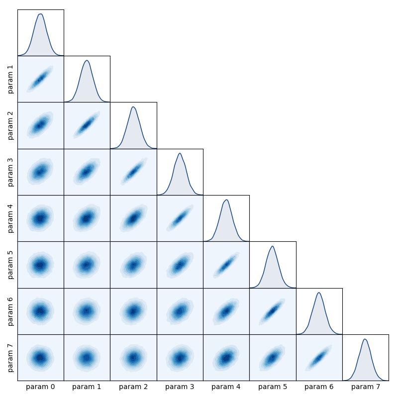
matrix_plot
- inference.plotting.matrix_plot(samples, labels: list[str] = None, show: bool = True, reference: Sequence[float] = None, filename: str = None, plot_style: str = 'contour', colormap: str = 'Blues', show_ticks: bool = None, point_colors: Sequence[float] = None, hdi_fractions=(0.35, 0.65, 0.95), point_size: int = 1, label_size: int = 10)
Construct a ‘matrix plot’ for a set of variables which shows all possible 1D and 2D marginal distributions.
- Parameters:
samples – A list of array-like objects containing the samples for each variable.
labels – A list of strings to be used as axis labels for each parameter being plotted.
show (bool) – Sets whether the plot is displayed.
reference – A list of reference values for each parameter which will be over-plotted.
filename (str) – File path to which the matrix plot will be saved (if specified).
plot_style (str) – Specifies the type of plot used to display the 2D marginal distributions. Available styles are ‘contour’ for filled contour plotting, ‘hdi’ for highest-density interval contouring, ‘histogram’ for hexagonal-bin histogram, and ‘scatter’ for scatterplot.
colormap (str) – The colormap to be used for plotting. Must be the name of a valid colormap present in
matplotlib.colormaps.show_ticks (bool) – By default, axis ticks are only shown when plotting less than 6 variables. This behaviour can be overridden for any number of parameters by setting show_ticks to either True or False.
point_colors – An array containing data which will be used to set the colors of the points if the plot_style argument is set to ‘scatter’.
point_size – An array containing data which will be used to set the size of the points if the plot_style argument is set to ‘scatter’.
hdi_fractions – The highest-density intervals used for contouring, specified in terms of the fraction of the total probability contained in each interval. Should be given as an iterable of floats, each in the range [0, 1].
label_size (int) – The font-size used for axis labels.
Create a spatial axis and use it to define a Gaussian process
from numpy import linspace, zeros, subtract, exp

N = 8
x = linspace(1, N, N)
mean = zeros(N)
covariance = exp(-0.1 * subtract.outer(x, x)**2)
Sample from the Gaussian process
from numpy.random import multivariate_normal
samples = multivariate_normal(mean, covariance, size=20000)
samples = [samples[:, i] for i in range(N)]
Use matrix_plot to visualise the sample data
from inference.plotting import matrix_plot
matrix_plot(samples)
trace_plot
- inference.plotting.trace_plot(samples, labels=None, show=True, filename=None)
Construct a ‘trace plot’ for a set of variables which displays the value of the variables as a function of step number in the chain.
- Parameters:
samples – A list of array-like objects containing the samples for each variable.
labels – A list of strings to be used as axis labels for each parameter being plotted.
show (bool) – Sets whether the plot is displayed.
filename (str) – File path to which the matrix plot will be saved (if specified).
hdi_plot
- inference.plotting.hdi_plot(x: ndarray, sample: ndarray, intervals: Sequence[float] = (0.65, 0.95), color: str = 'C0', axis=None, plot_mean=True, labels=True, interval_alpha: Sequence[float] = None)
Plot highest-density intervals for a given sample of model realisations.
- Parameters:
x – The x-axis locations of the sample data as a
numpy.ndarray.sample – A
numpy.ndarraycontaining the sample data, which has shape(n, len(x))wherenis the number of samples.intervals – The fractions of the total probability contained in each interval which is to be plotted as a Sequence of floats. All given values must be in the range [0, 1].
color (str) – The color to be used for plotting the intervals. Must be the name of a valid
matplotlibcolor.axis – A
matplotlib.pyplotaxis object which will be used to plot the intervals.plot_mean (bool) – If
True, the mean of the samples is also plotted on top of the highest-density intervals.labels (bool) – If
True, then labels will be assigned to each plot element such that they appear in the legend when usingmatplotlib.pyplot.legend.interval_alpha – A sequence of floats in the range [0, 1] specifying the ‘alpha’ value (which sets the color transparency) which is used when coloring the intervals for each given probability fraction.